“Lots of little things add up” is a month-long exhibition of recent prints and their processes from Overpass Projects. On view in the WaterFire Arts Center gallery from Thursday, February 10 through Sunday, March 6, 2022. A public opening is scheduled for Thursday, February 17, from 6-9 pm.
The WaterFire Arts Center store + gallery hours are Wednesday – Saturday, 10:00 a.m. – 5:00 p.m. and Thursday, 10:00 a.m. – 9:00 p.m.
Overpass Projects is an all-inclusive printmaking publisher in Providence, RI.
Director and master printer Julia Samuels works collaboratively with artists to produce a wide range of contemporary printmaking including etching, photogravure, engraving, silkscreen, lithography, letterpress and relief printmaking.
Working with artists from all medias and backgrounds, Overpass Projects explores the versatility of printmaking, bridges barriers between artistic disciplines and promotes cross-pollination between techniques.
Julia Samuels
Julia Samuels was born in Portsmouth, NH and earned her BFA in Printmaking from Pratt Institute in 2007. In Brooklyn she participated in building and managing The Gowanus Studio Space and also volunteered during the formative years of 596 Acres, an agency that helps neighbors gain access to vacant land in their communities. Julia earned her MFA in Printmaking from Rhode Island School of Design in 2015 and has since founded Overpass Projects in Pawtucket, RI. As master printer and director of Overpass Projects, Julia publishes and prints her own work as well as collaborative fine printmaking with other artists, bridging barriers between artistic disciplines and promoting cross-pollination between techniques. Examples of Julia’s personal and collaborative print work can be found in permanent collections of RISD Museum, Detroit Institute of Arts, Library of Congress, Hood Museum of Art and others. Julia’s work is currently available at Homegrown, 135 Gano St, Providence, RI 02906, WaterFire Arts Center shop as well as her website,
overpassprojects.com
Eric Diehl
Eric Diehl, originally from Lancaster, PA, received his MFA from Virginia Commonwealth University and BFA from Pratt Institute. He is the recipient of two Elizabeth Greenshields Foundation Grants and has shown his work throughout the United States. Diehl’s first solo exhibition “Neighborhood Watch” opened at the McKinley Arts and Culture Center in Reno, NV, in 2018. Past projects include “Auto-Paint, USA” a Kickstarter-funded cross-country painting journey exhibited at “The Local Tourist”(Los Angeles, CA) and “The Montauk Club”(Brooklyn, NY). Diehl has attended a handful of residencies including Mildred’s Lane (Pennsylvania) and Brush Creek Ranch (Wyoming). Bibliography includes New American Paintings, issue #118. Diehl lives and works in Beacon, NY.
ericdiehlpaintings.com
Kirstin Lamb
Kirstin Lamb is a painter living in Providence, Rhode Island and working in Pawtucket, Rhode Island. Kirstin studied painting at the Rhode Island School of Design, graduating with an MFA in 2005, and she received her AB in Visual Art and Literatures in English from Brown Univeristy in 2001. Kirstin’s work has been shown in venues across the country and abroad, recently showing at the Spring Break Art Fair in NY, Periphery Space at Paper Nautilus in Providence, RI, the Wassaic Project in Amenia, NY, the Fruitlands Museum in Harvard, MA and Providence College Galleries in Providence, RI, among others. She has attended residencies at the Atlantic Center for the Arts, Vermont Studio Center, Bunker Projects, the Wassaic Project, the Kimmel Harding Nelson Center for the Arts, The Ora Lerman Trust Soaring Gardens Artist Residency, and the Sam and Adele Golden Foundation. Kirstin recently completed a two-year contract curator position at The Yard, Williamsburg, a coworking space in Brooklyn that hosts solo and group shows quarterly, and has begun planning online and new curatorial projects in New England. Kirstin gratefully acknowledges the role that her 2020 Rhode Island State Council for the Arts grant has played in her newest work. Her work is in the collections of Fidelity Investments, Boston, MA, the Fruitlands Museum, Harvard, MA, and Providence College, Providence, RI, among others.
nitsrik.com
Overpass Projects
Overpass Projects is a fine art print publisher in Providence, RI, directed by master printmaker and artist Julia Samuels. Mastering the process-driven techniques of printmaking requires much in the way of patience, scientific understanding and knowledge gained only through experience. This can be daunting to artists to the point they never attempt any type of print-based process.
Julia invites artists of diverse backgrounds to work collaboratively on editions rooted in traditional techniques of printmaking while also tailoring those techniques to each artists’ individual way of working. To aid her collaborative practice Julia has developed several color proofing systems, building languages and visual guides that can be applied to each new project, calibrated to each process, and individualized to each artist.
Prints and their processes
Printmaking is a field of art-making most often attributed to the multiple. Each print cast from the same matrix is a unique work signed by the artist but also identical to the other impressions in the edition, the signed and numbered group of prints originating from the same matrix. More specifically, printmaking is a group of printing techniques that at the time of their inventions were the most advanced form of printing and used commercially, only to be outdated with a new technology. And it is this obsolescence that has allowed artists to elevate outmoded techniques to forms of fine art. Where once letterpresses and moveable type were used to spread news of current events, now they are freed from the job of informing the world and are used to create bespoke and artful text-based work.
Relief printmaking, including woodcut, wood engraving and linoleum cut (linocut), is by far the oldest form of printing. While wall labels can be very specific about the material of the matrix, “relief” refers more to how the ink is applied and printed. The process stays consistent, paradoxically direct and inverted, simple and complex, accessible to any artist regardless of experience or access to fancy tools, materials or equipment. In relief printmaking the artist starts with a solid block or plate with a uniform flat surface. The artist carves away negative space, rolls ink on the remaining high surface of the block, places paper on the inked block and transfers the ink with uniform and all over pressure applied with a press or by hand with a barren, often improvised.
Julia has extensively explored relief printmaking in her personal work, and on view are her most recent carvings. She maintains the goal to fool the viewer and subvert the medium with her carving style, “I want you to think you’re looking at a pen and ink drawing.” She chooses compositions and a style expressly difficult for carving and strives to hide her effort and struggle in the white areas of the print. The negative working process- carving away the space and printing what’s left behind- could easily result in the appearance of a white drawing on a black background, and Julia’s intent is to invert the energy of even the most sporadic sketches and gestural drawings into a carving that when printed maintains the spirit of the original drawing.
Etching is a process of imbedding an image into a metal plate using chemical means, with baths of acids or corrosive salts. A mirror-finish plate, in these examples copperplate, is coated with a ground that protects the metal from the etchant, and the artist selectively removes this ground by drawing with a needle. The plate is dipped into an etchant bath, in this case Ferric Chloride, and the areas of the plate exposed will etch deep into the plate. The areas protected by the ground will remain smooth. Printing ink is applied all over the plate and forced down into deeply etched lines and then carefully polished away from the smooth areas. To create a tonal effect, a powdered ground, aquatint, is dusted evenly across the surface of a clean plate and melted in place. Areas are etched selectively, precisely to a set time scale that separates the values of individual tones. Light tones may be etched in only a few seconds, and dark tones may take several minutes to an hour. In aquatint different tones are achieved through the varying thicknesses of the ink deposits, governed by the depth of the etch in the plate.
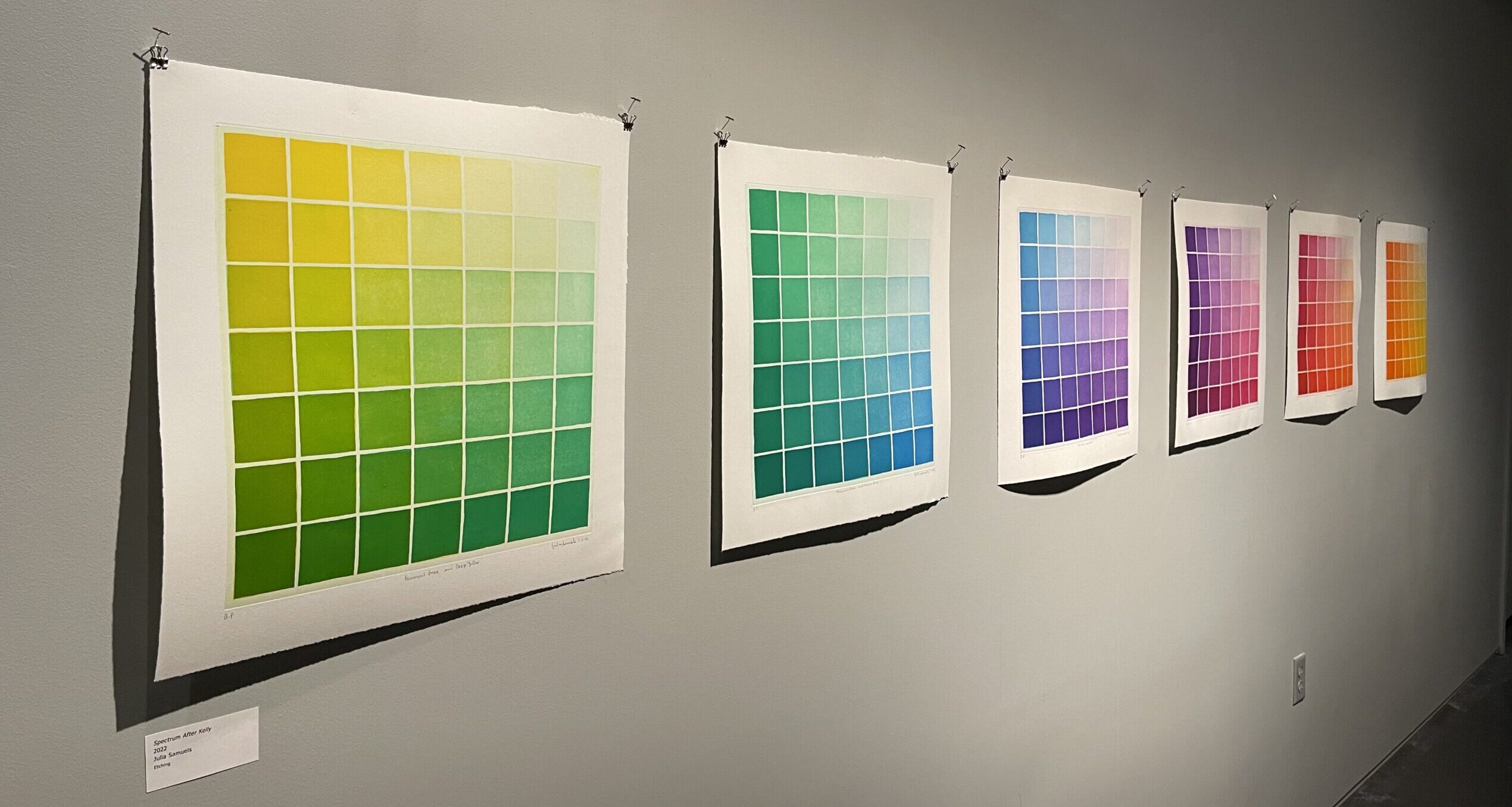
The continuous tone quality of aquatint- the ability to print many shades of gray to black from one plate- makes color work in this technique endlessly rich. Julia’s Aquatint Color Grids were designed to assist artists in understanding the visual capabilities using color palettes made with only two or three different colors of ink. Julia and Eric Diehl began their training in color theory together and have been creating collaborative color etchings for several years. They share a certain unspoken language around color mixing. Even with a close bond and understanding between printmaker and artist, the artist’s work is made easier with a guide to help map out a plate, or two or three. Eric’s examples of color etchings are indeed triumphs of the technique, maximizing the resulting spectrum, using each plate and ink color most efficiently.
Screen printing, silk screen or serigraphy is a process of forcing ink through a screen mesh. Various types of stencils can be applied to the screen, and these stencils block the passage of ink according to the artist’s design. Screen printing is highly chromatic and allows for almost endless layering of ink on top of ink. Opaque inks can be layered on top of each other, the new ink nearly obliterating the layers of ink beneath. Transparent inks can be layered, allowing multiple layers to interact and create new visible colors. The printer can print two colors and reveal three, the first and second individually and the third of their combination.
The Screen Print Color Proofing Grid is a tool designed for the scientific, regimented exploration of layering color in screen printing. The grid of 64 squares shows each of 64 possible permutations of six layers of screen printing. It is used as a definition, a printer’s standard while exploring specific ink mixtures geared towards different projects and artists’ palettes. The master printmaker can provide a true and accurate example of final color results before the artist’s design work is applied, allowing the artist to create freely within a color gamut of their choosing.
In solidarity with the Black Lives Matter movement, Kirstin Lamb illustrated the title slogan nestled within an elaborate floral wreath. Presented with this project, Julia insisted on applying the grid proofing system to accurately match Kirstin’s original painting and to add another layer of context through the process. Black pigment is made out of carbon, made out of organic matter after it is dead and burned, made out the remnants of death with no possibility of life. Instead of printing black ink, Julia employed her Screen Print Color Proofing Grid to find specific combinations of several high chroma colors that layer to create the illusion of black. These colors, made of organic and lively pigments, layer to create a black that is full of richness, subtlety, power and most importantly life. The resulting print is something that elevates the artist’s original work and in concept and material supports the goals of Black Lives Matter. All profits from Wreath are donated to the ACLU Legal Defense fund to support their mission of equitibility and justice for all.
About the author
Over the last 10+ years, alongside some incredible co-workers and volunteers, I've worked to build the organization that WaterFire Providence is today. As Director of Creative Services, my team and I work on visual communications, graphic design, the visitor experience, merchandising as well as project management for programming at the WaterFire Arts Center. Being a part of the 'Rhode Island' experience for tens of thousands of people is incredible and I have an intense pride in place for both Downtown Providence and the Valley neighborhood.