Interior Design Goals
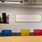
The interior of the WaterFire Arts Center is striking and bold! The colors and designs are chosen to align with the famous artist Piet Mondrian’s landmark quadrilateral paintings. The inspiration of his palette is carried throughout the buildings spaces and furnishings. Our building’s historic surfaces are unrestored but protected with a clear coat of finish. New interventions are pulled from these surfaces with bold color. Walls, large structural elements, and accents are colored with near primary reds, blues, yellows and rich black. This choice of finishes is powerful and direct, but also playful and invigorating. With a variety of uses for the space planned, the materials are also easy to maintain and replace throughout a busy lifetime.
WaterFire is ecstatic to be moving into such a vibrant space, and a huge part of that energy is delivered by Sarah Whiteley’s design. Sarah and her team at DBVW took WaterFire’s ideas and really made them come to life. You can learn more about DBVW at their website.
Building for the future is supported by TRAC Builders, LLC. To learn more about their contracting services, visit tracbuilders.com/
About the author
I've worked at WaterFire Providence since 2003. For the first 9 years of my career, I worked in the Production Shop learning all of the details that go into the physical production of the event. In 2012 transitioned to the role of managing WaterFire's social media and web presence. I now head up WaterFire Providence's digital projects including, web, social, databases, and our physical IT infrastructure.
