Essay by Roger Mandle
April 22, 2014
Listen to the essay, read by Maya Malik, WaterFire Providence Arts Management Intern.
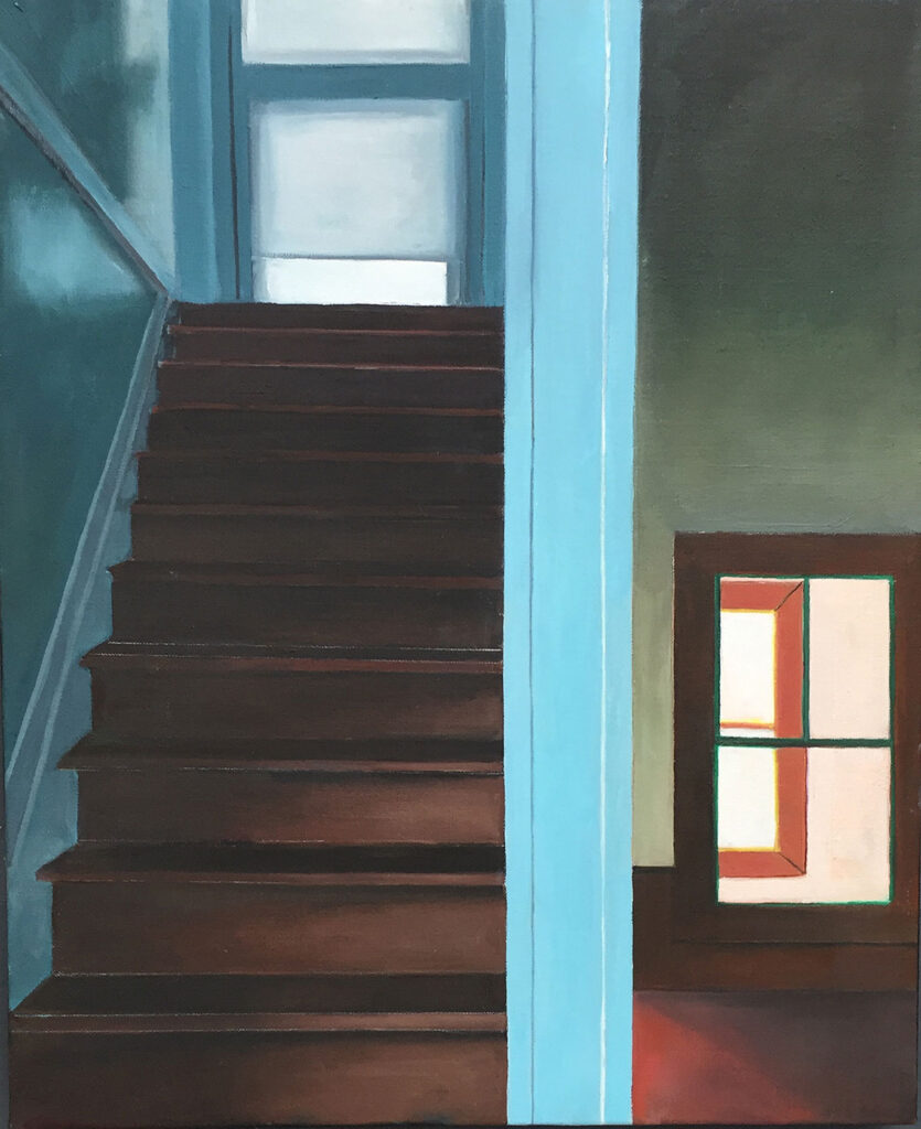
Every so often a painting can be so arresting in its directness and simplicity that it becomes an obsession. Such is the case with the little canvas I recently was shown by Gretchen Dow Simpson entitled Interior with Stairs. The painting, which measures only 22 inches by18 inches, is complex and mysterious – on the one hand torturing the viewer by its barriers to entry, and on the other, seductively welcoming the viewer to explore its divergent regions. Simpson has created a direct representation of an empty interior space that portrays a hallway and a stairway. Both of these areas are illuminated by windows at the rear of their territories, and by lighting that emanates from behind the viewer – and from behind the stairway at its bottom and its top. All of this light suggests multiple dimensions of space beyond the composition, creating a sense of expectation.
In Simpson’s painting, it is the unseen that is as important to the experience as what she has portrayed in this elegantly simple work. As in the work of Vermeer, light has a special power to suggest other spaces not available to the viewer that somehow influence the spaces one can see. The light emanating from the three windows portrayed in Simpson’s painting each has different color, personalities, and distance from the front picture plane. The “upstairs/downstairs” drama of the painting is emphasized by the windows at the end of each passageway. Each window projects its own color of light onto the space in front of it. The upstairs window has a shade partially drawn over it. The downstairs window is baldly open to a space behind it, and reveals half of another window perhaps in a neighboring house close by. Within itself, each window’s colors are subtly different, not unlike Mondrian’s incredibly soft distinctions of white in his paintings. In Simpson’s work, the window light is an active element infusing the limited territory around it with dimension and meaning. Simpson’s composition cuts the painting in half with an imposing wall end that signals the entry to the stair on the left and the hallway on the right. The artist has thrust the viewer’s point of view well into the space, editing it beyond the bottom of the stairs or the entry into the hallway to the right of them. The bright powder blue stair wall running top to bottom of the composition is a brutal divider between the stairs and the hallway. The stairs occupy about half the a windowed landing that perspective does not permit one to see. One can only imagine the floor or the bottom of the vacant window that emits a soft mysterious light onto the stairs and the wall on the far left. The downstairs hallway to the right ends with a window that looks out on a brighter wall and window that is blankly white. There is no escape from the interior through these windows. These windows are in parallel but offset from each other, forming a mathematical grid, like a geometry problem. In fact, Simpson’s entire composition is a geometry experiment; the Golden Mean is suggested in almost every aspect of the composition. The grid of lines forms an intensely tight composition of blocks relented only by the illusion of space and light. Even the lines are subtly left on stairs or windows as traces of Simpson’s further detailed compositional thoughts. The colors in the painting a quiet balance between warm and cool – help to project space and to create the hushed harmony of the architecture. The bright soft blue pier that divides the space is balanced by the brown tones of the stairs and hall floor and trim. The pink wall and red window is balanced by the subtle green outline around the hallway window. The glossily reflective stairway wall of greenish blue and grey frames the stairs, and leads to the blue window trim at the top of the stairs. The light emanating from the window is cool blue and white, contrasting with
the salmon-toned warm light from the window below. Thus the upstairs and downstairs are a “push-pull” of warm and cool colors emphasizing the spatial differences between them. Simpson has painted the work in broad flat areas, some of which have subdued tonal changes within them. She contrasted these areas with taught straight lines carefully drawn in paint that outline and define the architectural elements of the painting. This understated style of painting enhances the impact of the work, making the composition more dramatic by downplaying brushstrokes in favor of the linear description of the composition. The viewer is captured in a domestic setting of great power – greater perhaps than one first imagines – that is devoid of human presence (other than the house depicted was made by someone at some time in the past). The scene is inherently devoid of emotion in the same way that Edward Hopper’s quotidian paintings seem empty. Yet, as in Hopper’s work, Simpson’s painting evokes feelings of quiet sadness and loss. There is no noise in Simpson’s work. The shadows that lurk at the top of the stairs or darken the downstairs hallway seem to hide some greater truth that one is unable to see or fathom. The vacuous spaces that draw one’s eye up or back into the illuminated voids are filled with expectation: what’s around the comer at the top of the stairs or the end of the hallway? What’s going on in the room in the house next door?
Simpson’s slice of domestic interior has a timeless quality, although the architecture derives from an earlier period. The viewer is reminded of houses once visited, or even lived in, without knowing who has inhabited the space she’s depicted. The experience of viewing the painting is like remembering a dream. And the subject of the painting, elusive as it may be, is as much the tight glory of the composition as it is the lonely reality of the subject portrayed. Any great painting balances the complex relationships between ideas, perceived realities and compositional design. The tighter these relationships become, the more intense the experience of seeing them and learning what’s behind the perceptions we are inspired to behold, the greater the work of art. Simpson has created just such alchemy of these elements in an exceptional work of art that must be visited again and again.
Roger Mandle (1941 – 2020)
Former President of Rhode Island School of Design and Former Director of the Qatar Museums Authority


