Essay by Dominic Molon, Interim Chief Curator & Richard Brown Baker Curator of Contemporary Art, Rhode Island School of Design
2015
Listen to the essay, read by Maya Malik, WaterFire Providence Arts Management Intern.
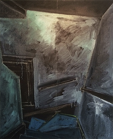
In his essay about “the uncanny” Sigmund Freud placed significant emphasis on the etymology of the German word for the condition-“unheimlich”-in the sense that it is “obviously the opposite of ‘heimlich’ [‘homely’], ‘heimisch’ [‘ native’]-the opposite of what is familiar.” Gretchen Dow Simpson’s recent series of paintings titled Structure (2015) that depict a sinister-appearing domestic stairwell play orl this notion of something in the home-that most familiar and reassuring of all places-becoming a threatening and unwelcome entity.
The ten uniformly sized images that comprise this serial presentation vary from picture to picture with regard to perspective, palette, the time-of-day represented, and formal approach. Some show the space during what appears to be late-afternoon in metallic greens and blues, while others possess a more nocturnal presence with windows and even the surrounding walls becoming chalkboard black (complete with the white outline of architectural details.) The linear presentation at first suggests the passage of time, with the occasional shifts in position conveying the experience of moving down or up the stairs and stopping to observe, reflect, and assess the unsettling spatial atmospherics. Yet these same locational variances also prompt an alternative way to approach the sequential display of the work, encouraging the viewer to move from image to image and then across the pictorial aggregate to focus on the particular characteristics of a single picture. Both ways of looking at and interpreting the work are informed by and demonstrate the intensively cinematic compositional strategies–the rendering of “off camera” lighting effects, for example, or the manner in which the imagery appears photographically cropped or framed-that inform each image and the series overall.
Considering Structure in relationship to popular narrative cinema, Simpson’s emphasis on a stairway as a site of uncertainty or even imminent malice evokes a broad range of instances throughout motion picture history where this architectural structure has served as a critical backdrop or even protagonist. One recalls, for example, private investigator Milton Arbogast ‘s surreal fall to his death down a flight of stairs in Alfred Hitchcock’s Psycho (1960); the stair-top struggle of wills that occurs between Laurie Strode and Michael Myers at the climax of John Carpenter’s Halloween (1978); or the chilling menace of the flashlit stairs seen from the killer’s point of view that opens Michael Mann’s psychological thriller Manhunter (1986).
Stairways convey an inherent sense of peril given the sense (and reality) that one false or careless step could result in varying degrees of physical calamity. Yet what imbues them with the kind of dread that the Structure series captures is perhaps the manner in which these spaces constrain vision. We often cannot see and know what awaits us at either the top or bottom of a stairway, a condition exaggerated by stairways that turn a corner mid-way like the one presented in Simpson’s work.
As liminal spaces that allow us to move from one place to another, stairways find our minds in a displaced state, focused either on the room we’d just left or, more likely, the room or place we are on our way to. The Structure paintings thus represent the unsettling ambiguities of these transitional spaces that are neither designed nor intended for lingering or resting.
The complex engagement of Simpson’s paintings with both the lived-physical dynamics of the stairway space and significant role they play in other cultural precedents is accentuated by the various techniques that give them form. While different shades of gray, green, and blue dominate-often possessing a somewhat metallic sheen or burnish-the “last” image in the series presents the stairs in a flat yet luminescent purple. This chromatic shift effects a sense of positive reassurance that whatever trepidations one might have had about this space are about to pass. The “central” images, as one moves from left to right, represent the darkness from which the final brighter image seems to emerge, with walls and window becoming an opaque black punctuated by mysterious white lines that either highlight hidden cracks or fissures in the surface or suggest ghostly intimations of rectilinear order and rationality within the vertiginous diagonal imbalance of the stairwell. The contrast between the more conventional representation of the stairs and these more abstract treatments of the walls is heightened further by comparing these works to the first three or four that one encounters on the left. These initial works are remarkable for their relative straightforwardness and, as such, set the stage for a descent of sorts into a perceptual, spatial and psychological state of disquieting imbalance.
Collectively, the 10 works that comprise Structure take us through the range of experiences and emotions that even the most familiar and quotidian space can inspire, and demonstrate how the domestic comforts of home have the potential to become uncanny, estranged, and positively “un-home-like.”
Dominic Molon
Interim Chief Curator & Richard Brown Baker Curator of Contemporary Art, Rhode Island School of Design
